![[blog of designer and illustrator james mcmorrow]](https://blogger.googleusercontent.com/img/b/R29vZ2xl/AVvXsEgxz4ROutX4LQyqFY7iwyLaHGg5J5uDWu5wp1BsK3ZqniPF7k2j2jr20Ftnv2RfekS_fMeluvnTfDPpO7sTMuBv9Cdxkxw6XItFpNc-ToY5hNx-_uyhaXqrebeF0jX_oJJjyTMOvFFvRcDs/s1600-r/blog_header.gif)
Today we officially begun our Professional Projects. The unit that will either act as a portfolio piece to get us jobs if we decide not to do a third year, or the unit that will pretty much get us onto the third year.
Dan took the session, handing out booklets that he had made to help us prepare, and to start our initial brainstorming. The booklet had four main sections -
- What are your strengths/what learned?
- Preferences?
- Where do you want to be?
- What type of work do you want to produce?
I worked through these sections and it helped a lot. It made me see in more detail what I want to achieve, and opened me up to new possibilities that I may not have thought of otherwise.
I see myself as both a Graphic Designer and an Illustrator, and am looking to progress onto third year Graphics. Therefore I am needing to have mainly a graphic project, but I am still wanting to implement illustration in there somehow.
I felt that I was a bit of an all rounder when it came to strengths and weaknesses. I feel that my only weakness really was Flash animation. I believe my strengths include print (poster design, magazine layouts), branding, illustration, web, and theory.
Obviously it would be pretty much impossible to implement all these strengths into a project, so I am going to have to pick and choose. I feel that my real passion lies within print, typography and illustration, so I am going to have to think of something I can do with this. I also enjoy the theoretical side, so having a project that I can link in with my theory unit would be ideal.
Another factor to deciding what I want to do is going to be that I need to choose something that is going to keep me motivated over these next 12 weeks, and something that is actually going to take 12 weeks. I feel that if I combine my passion for design with another passion of mine I will achieve this. Better get thinking!
23.1.09
[SCREEN BASED COMMUNICATION 2 EVALUATION]
Screen Based Communication has been a fun, stressful and challenging experience. I’ve been looking forward to this unit ever since I saw the 2nd years doing it last year. It’s a project that we not only learn from, but is used to showcase all our work to a whole world of possible employers. It’s something that I have taken pride in and am really happy with the final outcome. All the swearing and clenching my fists has been worth it in the end.
The first part of the project was to research into what web is and its history and future. I’m a user of the internet every day, and found it interesting to actually understand how it was created. It was also interesting to read how technical everything is, and how many bits there are to actually make it all work. I enjoyed reading about the future of the internet, and it’s current state of web 2.0. There’s still so much potential in it, and with the ever-advancing technologies we are in an exciting time.
I then researched into existing online portfolios. When researching I noticed that they all either had a black background or a white one, so I split my research accordingly. It was amazing to see that so many different designs and layouts worked so well. There was so many ways to present the work, each being successful in its own way. For each site I looked at the home page, gallery page, about me/info page. I decoded each site, looking at the colours, the font, the layout and what technologies they had used to create their sites. I also tried to write five good points (+) and five bad points (-) for each site. This proved difficult on some, as I could find nothing wrong with the site, or on the other hand nothing much good about it!
I took all the good points and bad points, and used this to help me decide what I wanted on my site and how I wanted it to look. This helped a lot in my layout design thumbnails, and I found myself quickly choosing a favourite design that I was going to use. I went down the route of having a white background site, with black san serif text, as I felt this best represented me and it looked clean and professional.
Branding myself I found to be quite easy. I know myself as a designer, and I know my style. The first obstacle was to choose whom I wanted to be known as to everyone else. Since I was young I have had the nickname buddah, and I wanted to take this forward and use it as my creative identity. It needed to be shortened though, need to look like a designers alias. I quite simply just reduced the number of letters in the word, but making it still pronounce Buddha. I settled with buda. I felt this to be professional, and was good to work under a name that meant a lot to me.
Choosing a name was simple, but I did however have a major swap of logos, as I had to think about how I would be perceived to the outside world. Initially I went down the route of having a monkey head illustrated in my style, with buda written underneath in Helvetica. When this was taken forward to the crit, the point was raised that this style (having a monkey) would attract a certain client base, but cut out quite a big one. I agreed profusely, and knew this had to be addressed as I wanted to attract a large audience. Another idea I had was to use a symbol as a logo. I decided to use an ampersand (&), and have this placed before buda to create &buda. Ampersand is a symbol for ‘and’, a word which is used to connect two things. I personally am trying to connect to people with my work.
As I sat down to make my website I noticed that I had forgotten how to use CSS. This made me panic a bit, but I was pointed towards some online video tutorials - www.willgoldstone.com/learn/#http://willgoldstone.com/learn/#. I found these too be very easy to follow, as he took you through every basic, and detail, as well as showing you where to click. The site also contains some very helpful pdfs, which I had by my side when I was making my site.
I then progressed onto building my site. My layout design was a site consisting of 2 rows and 3 columns. I struggled to get this all to line up and sit right. I eventually researched into absolute and relative positioning, and using a mixture of these, with different sized margins, I was able to produce the layout as I had wished. This layout was to be used throughout my site, with just the content being change on each page.
After building this layout from my measurements, I however felt the site balance wasn’t quite right and the image for the gallery wasn’t big enough. After a lot of calculation, I changed a lot of the measurements, including padding and margins to produce a new look site. It was the same layout, but had a bigger image, a better balance, and in my opinion looked a lot more professional.
On my home page I decided to include a flash show reel of my work. I got this idea from http://www.thedesignersrepublic.com/. I found there show reel to be very eye catching. The speed of it meant that it was almost subliminal, as you could see the work, but it made you want to look into the site further, and explore the work further. I took this idea and also implemented it into my contact page, having my buda from my logo change colours. I also put in one frame of a picture of me for fun, that some people may not see, but others will be bemused.
For my work gallery I used swap image. I used text links, to swap the main image. I encountered some problems but after adding in some code to add a span and a class, it worked a treat. This meant that each piece of work only had one page, regardless of how many images it had. This would save on a lot of loading. To the side of the image I had a short description for each piece, something that wouldn’t take long to read for the viewer so they wouldn’t lose interest.
For the design of my curriculum vitae, I deliberately left in the printers marks, and I feel this shows my style of work, as I am a graphic designer who loves cmyk. I tried to keep my cv short and to the point, as I felt potential employers wouldn’t have the time to read a lot of descriptive text, and that it would be the images of my work doing most of the talking.
Finally I made sure that my blogger and flickr links were attached to the home page. Not only to show off more of my work, but to also produce traffic to my site, and bump me up in the google ratings.
I have learnt loads by doing this project, from css to better time management skills, and it’s great to have my work finally available to everyone in the world. I’m now looking forward to start my professional project, and feel that branding and maybe a website could be incorporated into it.
The first part of the project was to research into what web is and its history and future. I’m a user of the internet every day, and found it interesting to actually understand how it was created. It was also interesting to read how technical everything is, and how many bits there are to actually make it all work. I enjoyed reading about the future of the internet, and it’s current state of web 2.0. There’s still so much potential in it, and with the ever-advancing technologies we are in an exciting time.
I then researched into existing online portfolios. When researching I noticed that they all either had a black background or a white one, so I split my research accordingly. It was amazing to see that so many different designs and layouts worked so well. There was so many ways to present the work, each being successful in its own way. For each site I looked at the home page, gallery page, about me/info page. I decoded each site, looking at the colours, the font, the layout and what technologies they had used to create their sites. I also tried to write five good points (+) and five bad points (-) for each site. This proved difficult on some, as I could find nothing wrong with the site, or on the other hand nothing much good about it!
I took all the good points and bad points, and used this to help me decide what I wanted on my site and how I wanted it to look. This helped a lot in my layout design thumbnails, and I found myself quickly choosing a favourite design that I was going to use. I went down the route of having a white background site, with black san serif text, as I felt this best represented me and it looked clean and professional.
Branding myself I found to be quite easy. I know myself as a designer, and I know my style. The first obstacle was to choose whom I wanted to be known as to everyone else. Since I was young I have had the nickname buddah, and I wanted to take this forward and use it as my creative identity. It needed to be shortened though, need to look like a designers alias. I quite simply just reduced the number of letters in the word, but making it still pronounce Buddha. I settled with buda. I felt this to be professional, and was good to work under a name that meant a lot to me.
Choosing a name was simple, but I did however have a major swap of logos, as I had to think about how I would be perceived to the outside world. Initially I went down the route of having a monkey head illustrated in my style, with buda written underneath in Helvetica. When this was taken forward to the crit, the point was raised that this style (having a monkey) would attract a certain client base, but cut out quite a big one. I agreed profusely, and knew this had to be addressed as I wanted to attract a large audience. Another idea I had was to use a symbol as a logo. I decided to use an ampersand (&), and have this placed before buda to create &buda. Ampersand is a symbol for ‘and’, a word which is used to connect two things. I personally am trying to connect to people with my work.
As I sat down to make my website I noticed that I had forgotten how to use CSS. This made me panic a bit, but I was pointed towards some online video tutorials - www.willgoldstone.com/learn/#http://willgoldstone.com/learn/#. I found these too be very easy to follow, as he took you through every basic, and detail, as well as showing you where to click. The site also contains some very helpful pdfs, which I had by my side when I was making my site.
I then progressed onto building my site. My layout design was a site consisting of 2 rows and 3 columns. I struggled to get this all to line up and sit right. I eventually researched into absolute and relative positioning, and using a mixture of these, with different sized margins, I was able to produce the layout as I had wished. This layout was to be used throughout my site, with just the content being change on each page.
After building this layout from my measurements, I however felt the site balance wasn’t quite right and the image for the gallery wasn’t big enough. After a lot of calculation, I changed a lot of the measurements, including padding and margins to produce a new look site. It was the same layout, but had a bigger image, a better balance, and in my opinion looked a lot more professional.
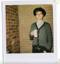
On my home page I decided to include a flash show reel of my work. I got this idea from http://www.thedesignersrepublic.com/. I found there show reel to be very eye catching. The speed of it meant that it was almost subliminal, as you could see the work, but it made you want to look into the site further, and explore the work further. I took this idea and also implemented it into my contact page, having my buda from my logo change colours. I also put in one frame of a picture of me for fun, that some people may not see, but others will be bemused.
For my work gallery I used swap image. I used text links, to swap the main image. I encountered some problems but after adding in some code to add a span and a class, it worked a treat. This meant that each piece of work only had one page, regardless of how many images it had. This would save on a lot of loading. To the side of the image I had a short description for each piece, something that wouldn’t take long to read for the viewer so they wouldn’t lose interest.
For the design of my curriculum vitae, I deliberately left in the printers marks, and I feel this shows my style of work, as I am a graphic designer who loves cmyk. I tried to keep my cv short and to the point, as I felt potential employers wouldn’t have the time to read a lot of descriptive text, and that it would be the images of my work doing most of the talking.
Finally I made sure that my blogger and flickr links were attached to the home page. Not only to show off more of my work, but to also produce traffic to my site, and bump me up in the google ratings.
I have learnt loads by doing this project, from css to better time management skills, and it’s great to have my work finally available to everyone in the world. I’m now looking forward to start my professional project, and feel that branding and maybe a website could be incorporated into it.
[WEBSITE IS NOW LIVE]
My online portfolio website is now live and can be seen here - http://visualcommunication.org/james_mcmorrow/index.html


16.1.09
[WEBSITE FINAL CRIT]
Final crit for the website today, and good news all around. Kit and Neil feel that my site works really well and that the navigation is easy, and best of all the website represents me well. One thing that I have to change is to make the Sub Menu header stand out more by a simple colour change to Magenta. Need to get into serious work mode now till deadline to make sure that it all gets completed and that I get a good mark out of it :)
15.1.09
[WEBSITE BUILDING PROGRESSION]
So far the building of the website is going pretty smoothly. I have encountered some problems though which have since been overcome.
The first being the site measurements. Once I had it built form the original site measurements I felt it to be unbalanced so I made a few alterations, making the main content area bigger, meaning I could have larger images of the work -


The first being the site measurements. Once I had it built form the original site measurements I felt it to be unbalanced so I made a few alterations, making the main content area bigger, meaning I could have larger images of the work -

Before.

After.
Another problem I encountered was to get my swap image to work. I wanted each piece of work to just be on one page so there wasn't lots of loading. Swap image usually works when an image thumbnail is clicked it will change the main image in the content area. However I wasn't using a thumbnail image I was using text all on one line. However when trying to use this as swap image it was selecting the whole line of text rather than each individual word. To overcome this I had to add a span class around each word to separate them and allow them to be used for swap image.
The final main problem I had to overcome was to make this swap image text to fit in with other links. As they weren't linking to another page, they technically weren't links and therefore couldn't have css applied to them. To get round this I tricked Dreamweaver by putting in a "#" as a link for each bit of text. This didn't load another page, but made Dreamweaver think it was a link.
The final main problem I had to overcome was to make this swap image text to fit in with other links. As they weren't linking to another page, they technically weren't links and therefore couldn't have css applied to them. To get round this I tricked Dreamweaver by putting in a "#" as a link for each bit of text. This didn't load another page, but made Dreamweaver think it was a link.
12.1.09
[DREAMWEAVER ONLINE TUTORIALS]
Well after sitting down determined to start building my website, I realised that I've pretty much forgot how to use Dreamweaver and use CSS!
In my hour of need Brendon pointed me towards these video tutorials for Dreamweaver - http://www.willgoldstone.com/learn/#. I've just completed these and found them to be excellent, and I'm now confident enough to crack on with my website.
Image of my tutorial website below -

In my hour of need Brendon pointed me towards these video tutorials for Dreamweaver - http://www.willgoldstone.com/learn/#. I've just completed these and found them to be excellent, and I'm now confident enough to crack on with my website.
Image of my tutorial website below -

9.1.09
[PROGRESSION AND CRITIQUE]
Taking my new identity forward I wanted to produce a cleaner site, with easily navigational sections.
The new site design is as below -

As you can see there are sections for each area of design, and within each section there is a further sub menu where each individual piece of work has its own page. Under the image there will be numbers allowing the viewer to flick between each images of that particular piece of work, without a new page being loaded. Another key piece of design is that my contact details will be on each page in the top right hand corner, meaning a potential customer wouldn't have to change the page if they wanted to contact me.
The feedback from the crit with Kit is as follows -
- The logo design is really good and represents me
- All work on the main menu should be above the about me and contact sections
- Print section - some people may mistake it for a print screen button? maybe have Graphics instead?
All the feedback was positive and I feel that I've pretty much got my final design and now need to get on with building it...
7.1.09
[IDENTITY - &BUDA]
One thing that I've been thinking about a lot after the crit is my identity. I feel I need to become more sophisticated. So unfortunately the monkey has to go, as it wouldn't appeal to a sophisticated company, and therefore cutting my target audience. As well as this I'm going to drop the serif font as it's not working brilliant.
Another idea for branding that I had was to use symbols. After some research and experimentation I've chosen to go with the '& (ampersand)' symbol. It stand for 'and - which means a conjunction that connect two things. My idea being I'm connecting the client with their customers through the means of design.
Here's my experimentation with this idea -


The logo that I'm set on using is -

Another idea for branding that I had was to use symbols. After some research and experimentation I've chosen to go with the '& (ampersand)' symbol. It stand for 'and - which means a conjunction that connect two things. My idea being I'm connecting the client with their customers through the means of design.
Here's my experimentation with this idea -


6.1.09
[CATTELL RONCA TALK]
Yesterday we had a talk from freelance Illustrator Cattell Ronca. She broke her presentation into sections, giving us advice on everything we need to know to become a successful freelance Illustrator. This advice can also be used for a freelance Graphic Designer as a lot of it was general.
1. DEFINE MARKET:
- editorial, design, greeting cards, advertising etc.
2. RESEARCH POTENTIAL CLIENTS:
- what kind of illustrations/designs are being used?
- look at publications.
3. ADDRESS THE RIGHT PERSON:
- record the names of art directors/editors (Get spelling right!).
- use directories - AOI directory, FileFX, Bikinilist. (Time saving but expensive)
4. SELF PROMOTION:
- your work must stand out, original, memorable (i.e handmade or limited edition), must have value.
- demonstrate your way of thinking and communicating an idea.
- good concept.
- how special are you?
- think outside the box.
5. SHOW YOUR PORTFOLIO:
- use names you collect to make appointments.
- your portfolio must be impeccable.
- include work only relevant for client.
- commissioned work goes in front.
- only include work you're most proud of.
- experimental work in back.
- max. size A3.
- no more than 20 pieces.
- no sketchbooks.
- always bring business card.
- ask AD who else they can recommend.
6. CREATE A WEBSITE:
- make it interesting.
- easy to navigate.
- must be available to everyone.
7. NETWORK:
- with other illustrators.
- keep in touch with people you studied with.
- regular contact with clients - send postcards?
- organise exhibitions.
8. GET COMMISSIONED:
- confirm commission in writing.
9. COPYRIGHT:
- your name.
- do not give it away, offer a licence.
- read smallprint, especially where it says 'ALL RIGHTS'.
10. PRICING:
- what is illustration used for?
- how big is the client?
- how big is the budget?
- circulation?
- area and duration of the licence?
I found the talk to be very inspiring and helpful, and I will be looking back over my notes from the talk before I go into the big wide world! After the talk she showed us through some of her work which I found to be very good and interesting.
Subscribe to:
Posts (Atom)