12.12.08

[WEBSITE INTERIM CRITIQUE]

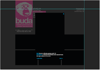
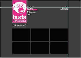
Had the first website critique today. For the crit we had to have some mock ups ready of an identity and how it would look incorporated into a site. As I was running out of time before the crit I decided to 'borrow' a site design from my research (aeiko.net) and add my own spin to it -

Variations of colours for each section.

Possible gallery page layout.

How when gallery image is clicked, would open in lightbox with a description.

Feedback from the critique is as follows -
- Serif font doesn't fit in with design
- Is the monkey too detailed?
- Experiment with websites and technologies
- Look into java for images
- Will CMYK be popular forever?
- Take on an outside approach - monkey wouldn't appeal to all companies, therefore cutting down my target audience.

The feedback has been really useful, and it seems there is a lot for me to think about!

9.12.08

[FURTHER RESEARCH]

After noticing that I had researched into all dark background sites, I saw it best to research into light coloured websites. Ones that stand out that I have researched so far include -

- http://www.eatock.com
- http://www.tonky.fr
- http://www.effectivedesign.com
- http://www.susannedunkel.com
- http://www.ivanmato.com

I've found these lighter websites, mostly white, to be much cleaner and simplistic in design. I find this makes for a more user friendly appearance and something that I'm seriously considering for mine.

6.12.08

[INK BAR WEBSITE LAUNCHED]

On Thursday evening we had a meeting with Chloe at the Ink Bar, where we were given our printed media examples for our portfolio. We also had our photos taken with our signage, due to ones taken on launch night being too dark. They were pretty cheesy and I look forward to seeing them! As a thank you for all our hard work we have been given a £20 gift voucher each for the Print Rooms, which I look forward to using. The meeting took place at 5.30pm and it was really good to see the place busy with people who had just finished work, as it proves the the relaunch has been a success.

So today whilst browsing the Print Rooms website to see what I can spend my voucher on, I noticed the new Ink Bar logo has been placed on the site (bottom right) -


and upon clicking it, you are taken to the newly launched Ink Bar website (http://www.ink-bournemouth.co.uk/), with the logo in its full glory -


Go check it out, and if you haven't so already go have a look at our work in it's full glory at the Ink Bar on Richmond Hill.

5.12.08

[IDENTITY PROGRESSION]

Before I can crack on with the layout designs of the site I need to brand myself. A lot of the sites that I have researched, the designer uses a creative identity. I like the idea of this and since I was young I have had the nickname of 'Buddah' (yup spelt incorrectly!)

This however I feel isn't snappy enough so I've quite simply taken away some letters, and gone with the creative identity of 'Buda'.

I then had to think of things that represent me. I see myself as both a Graphic Designer and an Illustrator. Colour wise it's going to be CMYK as I've built up quite an obsession with these! Font wise it's going to have to be a clean simple san serif font such as Helvetica or Myriad Pro, but maybe I could incorporate this with a serif font?

I also need to think of a logo to represent myself. Ideas that have come into my head include symbols and shapes, printers marks, and monkeys.

I've decided for now to go down the monkey route as it's fun and original. This is what I've come up with so far...

30.11.08

[INITIAL RESEARCH]

After some background research into what the web is and what it's future looks like I've decided to crack on with researching other designers portfolio sites.

A few that I've stumbled upon that I particularly like at this stage are -

- http://superlover.com.au
- http://aeiko.net
- http://dieneuemodern.com
- http://inside.nile.ru
- http://vault49.com

The main pages that I have been looking at are the home (index_ page, the gallery, and the about me/info page. As I feel these are the main pages that need to be designed, as they will either be containing a lot of images and/or text.

It has been interesting seeing the vastly different galleries ranging from tiled to sliding to lightbox. One thing I have noticed is that I have only been looking at really dark sites so far, so need to go in the search of some lighter ones!

27.11.08

[NEW UNIT - WEB DESIGN]

Finally just handed in everything for Visual Communication in Context 2 which is a huge relief. But no sooner as I get some weight off my shoulders I have something new jumping on. Today we were also given our brief for Screen Based Communication 2. I have been looking forward to this brief for absolutely ages, after seeing the then second years working on it last year. The main aim of the brief is for us to produce a web portfolio, which will house our work, acting as an online portfolio and curriculum vitae.

I really want to do well in this unit. I previously did ICT at A-Level and gained experience in Dreamweaver then, as well as taking part in the ABC Dreamweaver course (which I need to complete and hand in!). This unit isn't just about learning a new program and getting a grade, it is something that will be integral in getting my name out there and getting work.

There are lots of things to consider in this unit. The first point of call is for me to produce an identity for myself. Something that people can look at and get an idea of who I am and what my work is. Do I see myself as a graphic designer or as an illustrator, or both? Will I go under my alias 'Buda' or my name? I also need to think of what I want on my site, and how my site is to be navigated through. I need for my website to be unique and simple, something that people will enjoy looking through, and keep coming back to, to see what's new. This is all going to take a lot of research and hard work but I can't wait!
Was set our new brief today. The outcome is to be an online portfolio website that is easy to navigate and that represents us. I've been looking forward to this brief since I saw last years 2nd years building theirs. It feel that this is the first project to be of 'proper' use to get a name for ourselves, as we are presenting all our work that we have done so far, and showing off our web design skills on the way.

21.11.08

[INK BAR LAUNCH PARTY]

Last night we attended the Ink Bar launch party. It was surreal seeing all our work everywhere. Seeing my logo on the window graphics, the menus, the invitations, the flyers and even the key fobs! Its been a tough few weeks but it all feels so rewarding now, seeing our work printed and in the flesh.

We arrived at around 6pm and drank champagne till around 11.30pm. Was a great night and definitely something that I could get used to. We got to meet a fair few important people such as Andy Price (owner of the Ink Bar, Print Rooms, West Beach and Aruba), who congratulated us. We were also interviewed by Liz Lean the PR, and had our photos taken by DV8, the local newspaper and other publications. Is good knowing our hard work has been recognised. There will be a further meeting for us to collect examples of our printed media, and there has also been talk of a meal at the Print Rooms as a thank you!

19.11.08

[INK BAR LAUNCH T-MINUS 24 HOURS]

So after all our hard work we will see if it has been successful in less than 24 hours. Ink Bar officially opens today but there's still time for more work. Had a phone call earlier today from Chloe saying how everything is going to plan so far and even better that their expectations. My invites had been distributed, and they had already received over 100 replies. With the capacity of Ink Bar being just 90 people that is exciting news. With this success she was keen to get some more invites out, but fancied a change of colour. Chloe suggested green, but I felt that it didn't look too appealing so also put forward a blue version, which got chosen -


Also it's been confirmed that there is going to be press coverage there, and they will be interviewing us as well as taking pictures. So need to dress to impress!

18.11.08

[ANIMAL WATCH PACKAGING FINAL PIECE]

Here is my final watch packaging made to a 50% scale. Made with greyboard and complete with shredded newspaper protective insides -


Really happy with how it turned out. The package itself is really sturdy, proving that I picked a good net to work with. The illustrations stand out really well against the colour of the packaging.

14.11.08

[ANIMAL WATCH PACKAGING FINAL CRITIQUE]

Just had the final crit for the packaging project. Due to having a lot on with the whole Ink Bar live brief, I have been given an extension for this unit. I therefore didn't have a final piece to show in the crit.

I did have my final net complete with illustrations though -


My design went down well, and I received positive feedback. I discussed with everyone how this was to be made out of grey-board, and have shredded newspaper to protect the product. The idea of completely recyclable and simple packaging was well received and everyone seemed to be excited to see the final piece.

One thing that I did take out of the critique was that the final piece didn't have to be full size. This will make it easier for me to source the grey-board, as it now doesn't have to be so big. I'm thinking a 1:2 scale.

13.11.08

[FINAL ILLUSTRATIONS]

Here are the scans of the illustrations that are to be placed on the net of the design. Each panel represents a different aspect of design. Whether it is snowboard tricks interpreted with type, to a hand illustration of the product inside the box, it all links to together with a certain amount of movement and fluidity.

I have based this packaging on the Snowboard side of things, but it would be easily transferable to another sport that Animal is linked with, simply by chasing the snowflake symbols to a more related symbol, and changing the tricks to tricks related to the sport.

These simple changes would mean that all the different sports ranges of the watch packaging, would all link together and could be displayed as a set within a shop.

12.11.08

[FINAL NET]

This is the final net of my packaging complete with accurate measurements in mm.

11.11.08

[PACKAGING DESIGN CHOSEN]

After lots of experimentation I finally found the perfect template for my packaging. Tuck and tongue with gusset flap uses the bare minimum material, without the use of glue, meaning that it is very eco-friendly. This mixed with the Greyboard material choice make it a strong design, and meets my aims of it being recycable as well.

it is of simple design, and is also strong and sturdy. To protect the watch inside and to keep with the whole recycable and eco-friendly side of things I have decided on shredded newspaper. This is a good source of protection as well as being very cheap, and also links in I feel with the hand rendered type of the outside of the packaging, due to the contrast of digital type on the paper. The whole package is very durable, so links in well with the durability of my chosen watch range Mega Sport.

[MATERIAL CHOSEN]


Throughout this packaging project one of my primary aims was to make the packaging eco friendly and recycable. The main factor in achieving this will be the materials used.

After reading extensively into different materials that can be used for packaging, two really stood out for me. Them being Corrugated board and Greyboard.

My illustration graphics would either be printed onto the material directly, or onto brown paper that would then be wrapped around the material (like a parcel).

After experimenting with greyboard, and knowing its values and background, it became the obvious choice. The illustrations printed onto it look excellent, and has left me with the hard choice of whether to make it more parcel like, with having the graphic printed onto brown paper instead. However this would lead to a waste of materials, as in hindsight it isn’t actually needed.

10.11.08

[EXISTING ANIMAL WATCH PACKAGING]

A vital part of the research is to look at the existing Animal watch packaging. I visited the Animal shop and had a hands on feel of the packaging. The photos taken on my camera phone didn’t come out too well!

However whilst with one of my peers, he emailed Animal asking them if it was possible for them to send us examples of the packaging. Through the post about a week later they arrived, and better photos were able to be taken.

The packaging I feel isn’t in keeping with their brand at all. Yes it is nice packaging, but if the logo wasn’t there, you wouldn’t be able to tell who it was done for. The box itself was rather complex, with it containing three pieces. The lid, the main tray (housing the watch stand) and the bottom tray (containing the instructions).

I did like the fact that both the male and female packaging was the same (apart from the colours and logos).

[FELT TIP GRAFIK EXHIBITION]

Below is a selection of images from the Felt Tip Grafik exhibition. It was an exhibition of original artwork done by 30 graphic designers. They were literally given a blank piece of paper and pens and left to come up with whatever they wanted. The variation of all the work is amazing, and there are some really strong pieces.

I feel this exhibition links in with my idea of hand rendered type on parcel shape packaging, and I like the idea of just taking a pen and coming up with ideas on the spot, rather than careful planning. I feel this spontaneous act will be clear in the packaging, and will also reflect the spontaneous nature of extreme sports.

9.11.08

[DON'T PANIC ENVELOPES]

Whilst researching into the travel side of things, and how there would be a lot of parcels going back and forth, I stumbled across an illustrated FedEx parcel. The style I feel is very unique and looks great. The black pen on brown paper works very well, as it stands out and is eye catching. The use of different hand rendered type works really well also and is something that I can see myself looking into further for this project.

The black pen on brown paper reminded me of Don’t Panic packs which are available in London. The pack themselves contain club flyers, but I feel that the illustrations on all of them are excellent. They run a monthly competition on their website where the general public submit their designs, and the winner has theirs chosen.

Looking back at the FedEx parcel, it shows that the packaging itself doesn’t have to be overly complicated. It doesn’t need to be a crazy shape or have a special opening mechanism for it to stand out from the crowd. The design on the packaging I feel is what makes it stand out from others, and I feel I’m going to go down the direction of having simple packaging with an artistic design.

[PACKAGING IDEAS]

During our 1 day brief with our groups, I came across an ammo box which had been modified by the graffiti group Flying Fortress. I felt that the boldness of the illustrations on the box made it a really eye catching piece.

However the materials used in making the packaging, aren’t the most eco friendly and are not recycable, so therefore strays away from my concept.

I feel I can however take inspiration from the simple design, and the durability of the packaging.

[BILLIE JEAN]

I was given reference to a Creative Review that was a couple of years old that had a feature on a Ballpoint exhibition. After much delving through the back issues of Creative Review in the library I eventually found it.
After flicking through the magazine, I was drawn to one artist in particular, who coincedentally also designed the front cover of the issue to advertise the exhibition. Billie Jeans’ work I beleive is a breath of fresh air. Biro whether drawn on paper or a desk, works as a great medium. Even though I still feel that I am going to go down the route of using a pen rather than a biro, it has given me the idea of using thinner pens as well as thick.
One piece that I particularly like of Billie Jeans’ is the 30 years of Nike basketball shoes, that has a picture of a Nike Vandal trainer. I own this trainer and so can connect with the piece more. I also feel this sort of illustrative style in this piece could be put to good use maybe for a similar piece for an Animal watch campaign.

[HAND DRAWN RESEARCH CONTINUED]


As well as researching through books, I also conducted some research on the internet. From the greeting cards project I came across a website - ffffound.com. I can find myself literally sitting in front of my Mac for hours wading through page after page of design work, constantly gaining inspiration.
I stumbled across a lot of hand rendered type on the website. Ranging form graffiti on a wall, to carefully drawn vintage type on a napkin, to random words scribbled onto paper. All of it I find is very eye catching and effective for whatever use is intended.

8.11.08

[HAND DRAWN TYPE AND ILLUSTRATION RESEARCH]

I was pointed towards the book Handwritten by Steven Heller & Mirko Ilie, to research into different types of hand rendered type. I had a flick through this and came across these images that I particularly like and filled me with inspiration -


I think the scrawled aspect of the type shown in these images is really effective. It raw and untidy aspects make it appealing to the eye, as at a glance it may just look like a scribble, but it draws you in revealing more.
The amount of text used is also a key factor to it’s effectiveness, and is something that I’m going to have to take into consideration for my designs.


The Nike ACG campaign posters can be related to the extreme sports side of things with the Animal brand. The use of scratchy hand rendered type on the photographs is very effective, and something that I could push forward with on the P.O.S side of things.
The scratchy aspect of the type on this page, also links in with the injuries sustained in extreme sports. The scrapes and cuts can be seen in the text, as well as on the body.


Adding shadow to the type gives it an extra dimension. It makes it stand out and almost monumental compared to the rest of the type. This can be used with type that possibly contains more important information that the rest of the text on the packaging.
There are so many variation of hand rendered type. With a pen you can draw anything, and it’s my responsibility to keep a fluidity to the whole work, without losing the appeal of it being spontaneous.


I felt that a lot of the hand rendered type that I had come across had a sort of a graffiti feel to it, so I decided to have a flick through Street Sketchbook. The following few images are scans from the book. I not only looked at type, but also tried to look for pieces which had a lot going on.
Will Barras’s work is very fluid, full of movement, atmosphere and energy. His sketches whether it is biro or marker look like they have developed into stories. I like this aspect of this work and maybe I could implement something similar in my packaging to make it more exciting, and so the viewer can interact.
Bfree starts off without any idea of what he is doing; the first couple of lines determine the end result. I feel this spontaneity is clearly evident in his work, and is something that I want to try and implement into mine, as it makes the work more exciting.
Blu like Bfree draws without much conscious planning. He often starts by coming up with an anatomical idea or viewpoint to explore, sometimes with a visual pun or message in mind. The idea of using visual puns, i feel could add a humorous twist to my work.
Ekta in his own words: ‘I don’t like knowing too much about what I’m drawing till I’ve drawn it’. Although I can’t completely take that attitude, otherwise I wouldn’t be doing this research
i feel it does have a certain meaning to
it.


Elph’s drawings have a fluidity and spontaneity to them, which I’m strongly realising is a key aspect to a successful illustrative piece. I don’t think I can plan too much as in to what I’m drawing as it will take a certain element away from the final piece.
All of Wayne Horse’s pieces reveal a sense of humour and an awareness of the absurd side of popular culture. I feel that I need to get to know Animal as a brand and my target audience before I sit down and start illustrating; as my awareness will become evident in my work.
Guy McKinley beleives that, ‘If your image is hard to make and looks difficult, I think you can drown a piece’. This is something I need to keep in mind. Even though I want to have a lot going on in my work, I need to be careful that I don’t have too much going on.


Turbo likes to contrast the old with the new. I feel that using old style hand rendered tyoe with new will work well as there will be a big contrast between it all, but will still keep a certain amount of fluidity.
Ponk takes the essentials of graffiti letterforms, such as outlines, shading and highlights and adds his own fresh twist. Even though I want to try and steer a bit away from graffiti, I feel that it is going to be necessary to have a certain element of it within the work as the hand drawn and freestyle aspect of it will bring out my own personal style.
Remed sketches from a library of thoughts and shapes. He usually mixes several sketches and shapes and keeps an element of freestyle when he paints and draws. His ideas develop as words, icons, colours or shapes that begin to form a dialogue as they gradualy build up on the page. This gradual building and layering I feel is going to be needed to produce a successful piece.
Zetka states ‘For graphic design there are no limits and you can work in a more detailed way and take your time designing’. I need to produce a balance of how much I treat my packaging as a piece of graphic design, and a piece of spontaneity.
As with most of the previous artists, Luke Ramseys’ work is full of movement and still has a fluidity to it. He goes onto say, ‘I seldom sketch out my idea before applying the paint. I just let the paint stroke take me where it wants to’.

7.11.08

[INVITES CHOSEN]

Well another success with the Ink Bar brief. After having my logo chosen, I have just found out that my invites have been chosen as well -

Hey James

Well done, this has been a really tough decision, but we have chosen your design. We are getting them printed in both colours. Can you please change the text on the right hand side of your flyer to:
_________________________________________________________

In order for us to anticipate your attendance please fill in the enclosed card which will secure your invite to our fantastic re-launch party, plus free membership. For those signing up to our membership card we look forward to lavishing you with fresh and unbeatable dining and drinks promotions throughout the year.

If you are unable to attend the launch party, then pop in to have a look and exchange this invitation for a complimentary beer, glass of wine or enjoy a sumptuous glass of Champagne, before the Sunday 30th November.

______________________________________________________

If you can pop it back over and I can get them to the printers today.

Many thanks

Chloe Parmiter


Can't wait to see them printed after these few small alterations. Have also just found out that they will be using Megans' design for another leaflet, and using elements of Vickys' for a cover letter, so success all round!

6.11.08

[ANIMAL PACKAGING INITIAL IDEAS]

From the group presentation and research day I have come out with several ideas.

I want my packaging to -
- eco friendly and recycable
- for the Animal sports range watches
- to fit in their branding of hand drawn illustrations and type
- to be quite simple and inexpensive

From these ideas I am going to research into hand drawn illustrations, animal as a brand, recyclable materials and unique packaging ideas.

[INK BAR PROGRESSION]

Today we got to meet the graphic designer for West Beach, Aruba, Print Rooms as well as Ink Bar. We sat down with him along with Chloe Parmiter to discuss ideas, and how we can all work together to make sure we meet produce the best work we can, that all links together, as well as hitting the ever nearing deadline. We all had a brain storming session to produce ideas for promotion names, and how we can have running themes for the printed media through to the screen based website. The main aim of the day for Megan, Vicky and myself was to produce final invitations ready for print by 5.30pm. Earlier in the week we found out that Vickys' initial invitation designs were preferred so we all pushed these designs on further. Below are the designs that I put forward (click to see bigger) -


After seeing what the designer had done so far with the Ink Bar menus I tried to take elements of this and implement it into the invitations. I used a similar graphic of ink in water, and used an ink wash on the back to bring an element of ink onto both sides of the invitation. I experimented with two colours, so that it would appeal to both sexes, as I felt that the pink ink may lean towards the females. I had positive feedback from Chloe and look forward to hearing whose designs have been chosen.

4.11.08

[INK BAR BEGINS]

So now the real work begins. The work that will be printed. The work that the public will see. It's all rather exciting. We've split into two smaller groups. Megan, Vicky and myself working on the printed media; whilst Luke and George work on the website.
Today we had a crack with the launch party invitations. Without knowing the exact colours they want to use, and what blurb they want featuring on the invitations it was quite a difficult task. We all had to take our own interpretation on things.


The colours I've chosen link in with the interior design of the refurbishment, however they are likely to change when we are given the exact Pantones. Chloe has a meeting tomorrow with the graphic designer and management, so hopefully we'll know more then.

3.11.08

[INK BAR - MISSION ACCOMPLISHED!]

Just found out that our groups pitch for the Inkbar has been chosen. Even better news is that it was my logo that they chose out of all the designs our group put forward. It's a great personal achievement, and I feel an even better group achievement as they originally wanted to get away from the Ink brand.

After all the stress with first convincing them that the brand name 'The Office' was a bad one, and then all the name changes from Ink Bar, to Bar Ink, to Bar Ink Dot, to Ink Dot and then finally back to Ink Bar; it was a great feeling to have our idea chosen. There was a bit of luck as they had previously been a bit cautious with the name Ink because of trademark issues with a bar in Manchester by the same name. But very recently that bar has been rebranded to the O Bar, meaning that we got the go ahead with Ink Bar. My chosen logo below -


Now that we have the name and a solid brand and logo, we are to produce all the promotional material to go along with the bar. We are needed to design invitations, christmas flyers, window graphics, key fobs and a website. They did offer to take over and push forward with our brand from here on in, but as a group we felt that we didn't want someone else to takeover after all the hard work that we have put in. It's going to be tough especially with all of our course work as well but it's all going to be worth while in the end.

Their launch date is still scheduled in for 20th November which means that we are going to have strict and tight deadlines to meet, but in the end this is going to look great in our portfolios. We have also all been invited and put on the guest list for the launch night, which should be a good experience (fingers crossed for a free bar!). As well as this, there has been talk of Chloe and Matt trying to get press coverage on the whole relaunch and rebrand, which is going to be an amazing opportunity to get our names out there.

This is the first serious live brief that I have taken part in and even with all the stresses and deadlines, I've had fun and it has been very successful. It's also confirmed in my mind I've made the right career choice of being a graphic designer.

[PAL SESSION 4]

Todays PAL session was rather disappointing. Firstly I ran late and ended up arriving 15 minutes into the session which is not a good start. It's even worst when the session is about time management! I need to take in some of the advice we gave the first years to make sure I'm there with plenty of time to spare next week.

The session itself I found to not be very successful. It seems that some of the first years aren't that interested in what we have to offer. Maybe that's due to us not having the same power and authority as the teachers, or maybe they don't need our help this early into the year, because they're still finding their feet. I think they do need to realise that us PAL leaders aren't timetabled to be in, and we are coming in on our own accord to help them.

Today as mentioned, we covered time management. We got them into groups and made them discuss what was important and urgent that they need doing. After this we split them into pairs and got them to fill in a timetable to manage their workload. It was good to see that everyone in the end took something from the session.

After PAL all the PAL leaders got together Kit and discussed a plan for next week. After quite a lengthy discussion it appears that we have settled on a mini critique session, as some of the first years in our group wanted help with presentation skills.

[INK DOT / INK BAR]

Well tomorrow morning (well now today), the final decision is going to be made on the brand and designs that they are choosing for the Ink Rooms rebrand. It has been stressful, and seemed like we are going in circles sometimes with all the name changes. Currently it looks like they are set on calling it Ink Dot. Spoke to Chloe earlier and she said that the designs that we sent her last night, were all great and not to spend any more time on it. Chloe did mention however that we should put our logos into context as the 'main boss' who has the final say isn't a very creative man and he needs as many visuals as possible. So tonight I've been battling away again and put my Ink dot (I took away the bar) into context - 


I also decided on the off chance that they may choose it, even with all the trademark issues, to put forward my favourite logo of the Ink Bar -


Megan also put forward two of her designs in context (only displaying the first slide of each pdf) -


and Luke put forward his strongest idea -


Well its now in Chloes' hands to push our ideas forward, along with James Ramsays' Ninety-Five Bar pitch. Fingers crossed that my groups idea is chosen, as it would be great to see all our hard work pay off. Will post an update as soon as I know.

1.11.08

[BAR INK DOT]

Another day and another name change! Chloe has now put forward the idea that the name Bar Ink dot would work well. So today had a bit of a mad one, and produced all the logos below -


As you can see I've taken some ideas that I've used previously and incorporated them into my new logos. Also tried some new ideas. Guessing tomorrow there will be another change to the brand!