![[blog of designer and illustrator james mcmorrow]](https://blogger.googleusercontent.com/img/b/R29vZ2xl/AVvXsEgxz4ROutX4LQyqFY7iwyLaHGg5J5uDWu5wp1BsK3ZqniPF7k2j2jr20Ftnv2RfekS_fMeluvnTfDPpO7sTMuBv9Cdxkxw6XItFpNc-ToY5hNx-_uyhaXqrebeF0jX_oJJjyTMOvFFvRcDs/s1600-r/blog_header.gif)
Showing posts with label critique. Show all posts
Showing posts with label critique. Show all posts
16.1.09
[WEBSITE FINAL CRIT]
Final crit for the website today, and good news all around. Kit and Neil feel that my site works really well and that the navigation is easy, and best of all the website represents me well. One thing that I have to change is to make the Sub Menu header stand out more by a simple colour change to Magenta. Need to get into serious work mode now till deadline to make sure that it all gets completed and that I get a good mark out of it :)

9.1.09
[PROGRESSION AND CRITIQUE]
Taking my new identity forward I wanted to produce a cleaner site, with easily navigational sections.
The new site design is as below -

As you can see there are sections for each area of design, and within each section there is a further sub menu where each individual piece of work has its own page. Under the image there will be numbers allowing the viewer to flick between each images of that particular piece of work, without a new page being loaded. Another key piece of design is that my contact details will be on each page in the top right hand corner, meaning a potential customer wouldn't have to change the page if they wanted to contact me.
The feedback from the crit with Kit is as follows -
- The logo design is really good and represents me
- All work on the main menu should be above the about me and contact sections
- Print section - some people may mistake it for a print screen button? maybe have Graphics instead?
All the feedback was positive and I feel that I've pretty much got my final design and now need to get on with building it...
The new site design is as below -

As you can see there are sections for each area of design, and within each section there is a further sub menu where each individual piece of work has its own page. Under the image there will be numbers allowing the viewer to flick between each images of that particular piece of work, without a new page being loaded. Another key piece of design is that my contact details will be on each page in the top right hand corner, meaning a potential customer wouldn't have to change the page if they wanted to contact me.
The feedback from the crit with Kit is as follows -
- The logo design is really good and represents me
- All work on the main menu should be above the about me and contact sections
- Print section - some people may mistake it for a print screen button? maybe have Graphics instead?
All the feedback was positive and I feel that I've pretty much got my final design and now need to get on with building it...
12.12.08
[WEBSITE INTERIM CRITIQUE]
Had the first website critique today. For the crit we had to have some mock ups ready of an identity and how it would look incorporated into a site. As I was running out of time before the crit I decided to 'borrow' a site design from my research (aeiko.net) and add my own spin to it -

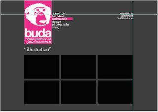
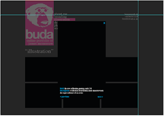

Variations of colours for each section.

Possible gallery page layout.

How when gallery image is clicked, would open in lightbox with a description.
Feedback from the critique is as follows -
- Serif font doesn't fit in with design
- Is the monkey too detailed?
- Experiment with websites and technologies
- Look into java for images
- Will CMYK be popular forever?
- Take on an outside approach - monkey wouldn't appeal to all companies, therefore cutting down my target audience.
The feedback has been really useful, and it seems there is a lot for me to think about!
- Serif font doesn't fit in with design
- Is the monkey too detailed?
- Experiment with websites and technologies
- Look into java for images
- Will CMYK be popular forever?
- Take on an outside approach - monkey wouldn't appeal to all companies, therefore cutting down my target audience.
The feedback has been really useful, and it seems there is a lot for me to think about!
14.11.08
[ANIMAL WATCH PACKAGING FINAL CRITIQUE]
Just had the final crit for the packaging project. Due to having a lot on with the whole Ink Bar live brief, I have been given an extension for this unit. I therefore didn't have a final piece to show in the crit.
I did have my final net complete with illustrations though -

My design went down well, and I received positive feedback. I discussed with everyone how this was to be made out of grey-board, and have shredded newspaper to protect the product. The idea of completely recyclable and simple packaging was well received and everyone seemed to be excited to see the final piece.
One thing that I did take out of the critique was that the final piece didn't have to be full size. This will make it easier for me to source the grey-board, as it now doesn't have to be so big. I'm thinking a 1:2 scale.
I did have my final net complete with illustrations though -

My design went down well, and I received positive feedback. I discussed with everyone how this was to be made out of grey-board, and have shredded newspaper to protect the product. The idea of completely recyclable and simple packaging was well received and everyone seemed to be excited to see the final piece.
One thing that I did take out of the critique was that the final piece didn't have to be full size. This will make it easier for me to source the grey-board, as it now doesn't have to be so big. I'm thinking a 1:2 scale.
9.10.08
[LOOK AGAIN / THINK AGAIN FINAL CRIT]
The first critique of the new academic year. Overall it was very good feedback. Neil felt it was a good campaign, with a good, strong and simple design; which is easily understandable. It was felt though that it could do with a bit of playing around to make it the finished article. Improvements suggested were that -
- Need more clarification from the bottom text, maybe explain the campaign a bit further?
- Could treat it as if the law has come into effect and it is a general public info advertisement.
Not major changes and merely suggestions, which is always a sign of a good piece of design. The general feeling was that it was nearly there, just needed wording slightly different. Was also suggested that the green crosses could be seen as looking positive, but I didn't agree with this as the Pharmacy symbol is world renowned. Another suggestion was to have the pharmacy symbol defeating and stamping out the cigarette, and I will look into this further. Overall I am really happy with the feedback from my first unit of the 2nd year.
8.10.08
[STUDENT CRIT & FINAL DESIGN]
We arranged a small critique between a group of about 8 of us. It was good to see how well everyones ideas had come forward and there was some really strong designs. I used my time in front of everyone to gain a general opinion on what they thought was a stronger poster, with or without a frame. A clear winner with 7 votes to 2 was the poster with the frame, and this is the poster I will take forward with me tomorrow to the final critique. One small suggestion was to make the warning label text slightly smaller to give a bit more white space. My final design is below -

Everyone really liked my design and this filled me with confidence ahead of tomorrow.

Everyone really liked my design and this filled me with confidence ahead of tomorrow.
Subscribe to:
Posts (Atom)