![[blog of designer and illustrator james mcmorrow]](https://blogger.googleusercontent.com/img/b/R29vZ2xl/AVvXsEgxz4ROutX4LQyqFY7iwyLaHGg5J5uDWu5wp1BsK3ZqniPF7k2j2jr20Ftnv2RfekS_fMeluvnTfDPpO7sTMuBv9Cdxkxw6XItFpNc-ToY5hNx-_uyhaXqrebeF0jX_oJJjyTMOvFFvRcDs/s1600-r/blog_header.gif)
Just received my assessment record back for this unit, and it seems all the hard work has paid off! I got a 67, my highest mark on the course yet.
The feedback that I received is as follows -
LO3 - the final website is very you. It is easy to navigate and displays your work very well; the design compliments your work well. The categorisation of the work is good, but I might make the initial slide show less relentless. This does show a very good use of software and a range of design abilities.
LO2 - you've worked through the design part of the project very well. Many of your logo solutions could have worked well, but you made some good choices. Your planning is robust and has clearly aided your decision making and you've described your processes well.
LO1 - you've amassed a lot of relevant information that show you've looked at the subject broadly, through this gaining a good understanding that will serve you well in the future.
Overall, it is all very good feedback. Now to take this onto my Professional Project...
Showing posts with label screen based communication 2. Show all posts
Showing posts with label screen based communication 2. Show all posts

23.1.09
[SCREEN BASED COMMUNICATION 2 EVALUATION]
Screen Based Communication has been a fun, stressful and challenging experience. I’ve been looking forward to this unit ever since I saw the 2nd years doing it last year. It’s a project that we not only learn from, but is used to showcase all our work to a whole world of possible employers. It’s something that I have taken pride in and am really happy with the final outcome. All the swearing and clenching my fists has been worth it in the end.
The first part of the project was to research into what web is and its history and future. I’m a user of the internet every day, and found it interesting to actually understand how it was created. It was also interesting to read how technical everything is, and how many bits there are to actually make it all work. I enjoyed reading about the future of the internet, and it’s current state of web 2.0. There’s still so much potential in it, and with the ever-advancing technologies we are in an exciting time.
I then researched into existing online portfolios. When researching I noticed that they all either had a black background or a white one, so I split my research accordingly. It was amazing to see that so many different designs and layouts worked so well. There was so many ways to present the work, each being successful in its own way. For each site I looked at the home page, gallery page, about me/info page. I decoded each site, looking at the colours, the font, the layout and what technologies they had used to create their sites. I also tried to write five good points (+) and five bad points (-) for each site. This proved difficult on some, as I could find nothing wrong with the site, or on the other hand nothing much good about it!
I took all the good points and bad points, and used this to help me decide what I wanted on my site and how I wanted it to look. This helped a lot in my layout design thumbnails, and I found myself quickly choosing a favourite design that I was going to use. I went down the route of having a white background site, with black san serif text, as I felt this best represented me and it looked clean and professional.
Branding myself I found to be quite easy. I know myself as a designer, and I know my style. The first obstacle was to choose whom I wanted to be known as to everyone else. Since I was young I have had the nickname buddah, and I wanted to take this forward and use it as my creative identity. It needed to be shortened though, need to look like a designers alias. I quite simply just reduced the number of letters in the word, but making it still pronounce Buddha. I settled with buda. I felt this to be professional, and was good to work under a name that meant a lot to me.
Choosing a name was simple, but I did however have a major swap of logos, as I had to think about how I would be perceived to the outside world. Initially I went down the route of having a monkey head illustrated in my style, with buda written underneath in Helvetica. When this was taken forward to the crit, the point was raised that this style (having a monkey) would attract a certain client base, but cut out quite a big one. I agreed profusely, and knew this had to be addressed as I wanted to attract a large audience. Another idea I had was to use a symbol as a logo. I decided to use an ampersand (&), and have this placed before buda to create &buda. Ampersand is a symbol for ‘and’, a word which is used to connect two things. I personally am trying to connect to people with my work.
As I sat down to make my website I noticed that I had forgotten how to use CSS. This made me panic a bit, but I was pointed towards some online video tutorials - www.willgoldstone.com/learn/#http://willgoldstone.com/learn/#. I found these too be very easy to follow, as he took you through every basic, and detail, as well as showing you where to click. The site also contains some very helpful pdfs, which I had by my side when I was making my site.
I then progressed onto building my site. My layout design was a site consisting of 2 rows and 3 columns. I struggled to get this all to line up and sit right. I eventually researched into absolute and relative positioning, and using a mixture of these, with different sized margins, I was able to produce the layout as I had wished. This layout was to be used throughout my site, with just the content being change on each page.
After building this layout from my measurements, I however felt the site balance wasn’t quite right and the image for the gallery wasn’t big enough. After a lot of calculation, I changed a lot of the measurements, including padding and margins to produce a new look site. It was the same layout, but had a bigger image, a better balance, and in my opinion looked a lot more professional.
On my home page I decided to include a flash show reel of my work. I got this idea from http://www.thedesignersrepublic.com/. I found there show reel to be very eye catching. The speed of it meant that it was almost subliminal, as you could see the work, but it made you want to look into the site further, and explore the work further. I took this idea and also implemented it into my contact page, having my buda from my logo change colours. I also put in one frame of a picture of me for fun, that some people may not see, but others will be bemused.
For my work gallery I used swap image. I used text links, to swap the main image. I encountered some problems but after adding in some code to add a span and a class, it worked a treat. This meant that each piece of work only had one page, regardless of how many images it had. This would save on a lot of loading. To the side of the image I had a short description for each piece, something that wouldn’t take long to read for the viewer so they wouldn’t lose interest.
For the design of my curriculum vitae, I deliberately left in the printers marks, and I feel this shows my style of work, as I am a graphic designer who loves cmyk. I tried to keep my cv short and to the point, as I felt potential employers wouldn’t have the time to read a lot of descriptive text, and that it would be the images of my work doing most of the talking.
Finally I made sure that my blogger and flickr links were attached to the home page. Not only to show off more of my work, but to also produce traffic to my site, and bump me up in the google ratings.
I have learnt loads by doing this project, from css to better time management skills, and it’s great to have my work finally available to everyone in the world. I’m now looking forward to start my professional project, and feel that branding and maybe a website could be incorporated into it.
The first part of the project was to research into what web is and its history and future. I’m a user of the internet every day, and found it interesting to actually understand how it was created. It was also interesting to read how technical everything is, and how many bits there are to actually make it all work. I enjoyed reading about the future of the internet, and it’s current state of web 2.0. There’s still so much potential in it, and with the ever-advancing technologies we are in an exciting time.
I then researched into existing online portfolios. When researching I noticed that they all either had a black background or a white one, so I split my research accordingly. It was amazing to see that so many different designs and layouts worked so well. There was so many ways to present the work, each being successful in its own way. For each site I looked at the home page, gallery page, about me/info page. I decoded each site, looking at the colours, the font, the layout and what technologies they had used to create their sites. I also tried to write five good points (+) and five bad points (-) for each site. This proved difficult on some, as I could find nothing wrong with the site, or on the other hand nothing much good about it!
I took all the good points and bad points, and used this to help me decide what I wanted on my site and how I wanted it to look. This helped a lot in my layout design thumbnails, and I found myself quickly choosing a favourite design that I was going to use. I went down the route of having a white background site, with black san serif text, as I felt this best represented me and it looked clean and professional.
Branding myself I found to be quite easy. I know myself as a designer, and I know my style. The first obstacle was to choose whom I wanted to be known as to everyone else. Since I was young I have had the nickname buddah, and I wanted to take this forward and use it as my creative identity. It needed to be shortened though, need to look like a designers alias. I quite simply just reduced the number of letters in the word, but making it still pronounce Buddha. I settled with buda. I felt this to be professional, and was good to work under a name that meant a lot to me.
Choosing a name was simple, but I did however have a major swap of logos, as I had to think about how I would be perceived to the outside world. Initially I went down the route of having a monkey head illustrated in my style, with buda written underneath in Helvetica. When this was taken forward to the crit, the point was raised that this style (having a monkey) would attract a certain client base, but cut out quite a big one. I agreed profusely, and knew this had to be addressed as I wanted to attract a large audience. Another idea I had was to use a symbol as a logo. I decided to use an ampersand (&), and have this placed before buda to create &buda. Ampersand is a symbol for ‘and’, a word which is used to connect two things. I personally am trying to connect to people with my work.
As I sat down to make my website I noticed that I had forgotten how to use CSS. This made me panic a bit, but I was pointed towards some online video tutorials - www.willgoldstone.com/learn/#http://willgoldstone.com/learn/#. I found these too be very easy to follow, as he took you through every basic, and detail, as well as showing you where to click. The site also contains some very helpful pdfs, which I had by my side when I was making my site.
I then progressed onto building my site. My layout design was a site consisting of 2 rows and 3 columns. I struggled to get this all to line up and sit right. I eventually researched into absolute and relative positioning, and using a mixture of these, with different sized margins, I was able to produce the layout as I had wished. This layout was to be used throughout my site, with just the content being change on each page.
After building this layout from my measurements, I however felt the site balance wasn’t quite right and the image for the gallery wasn’t big enough. After a lot of calculation, I changed a lot of the measurements, including padding and margins to produce a new look site. It was the same layout, but had a bigger image, a better balance, and in my opinion looked a lot more professional.
On my home page I decided to include a flash show reel of my work. I got this idea from http://www.thedesignersrepublic.com/. I found there show reel to be very eye catching. The speed of it meant that it was almost subliminal, as you could see the work, but it made you want to look into the site further, and explore the work further. I took this idea and also implemented it into my contact page, having my buda from my logo change colours. I also put in one frame of a picture of me for fun, that some people may not see, but others will be bemused.
For my work gallery I used swap image. I used text links, to swap the main image. I encountered some problems but after adding in some code to add a span and a class, it worked a treat. This meant that each piece of work only had one page, regardless of how many images it had. This would save on a lot of loading. To the side of the image I had a short description for each piece, something that wouldn’t take long to read for the viewer so they wouldn’t lose interest.
For the design of my curriculum vitae, I deliberately left in the printers marks, and I feel this shows my style of work, as I am a graphic designer who loves cmyk. I tried to keep my cv short and to the point, as I felt potential employers wouldn’t have the time to read a lot of descriptive text, and that it would be the images of my work doing most of the talking.
Finally I made sure that my blogger and flickr links were attached to the home page. Not only to show off more of my work, but to also produce traffic to my site, and bump me up in the google ratings.
I have learnt loads by doing this project, from css to better time management skills, and it’s great to have my work finally available to everyone in the world. I’m now looking forward to start my professional project, and feel that branding and maybe a website could be incorporated into it.
[WEBSITE IS NOW LIVE]
My online portfolio website is now live and can be seen here - http://visualcommunication.org/james_mcmorrow/index.html


16.1.09
[WEBSITE FINAL CRIT]
Final crit for the website today, and good news all around. Kit and Neil feel that my site works really well and that the navigation is easy, and best of all the website represents me well. One thing that I have to change is to make the Sub Menu header stand out more by a simple colour change to Magenta. Need to get into serious work mode now till deadline to make sure that it all gets completed and that I get a good mark out of it :)
15.1.09
[WEBSITE BUILDING PROGRESSION]
So far the building of the website is going pretty smoothly. I have encountered some problems though which have since been overcome.
The first being the site measurements. Once I had it built form the original site measurements I felt it to be unbalanced so I made a few alterations, making the main content area bigger, meaning I could have larger images of the work -


The first being the site measurements. Once I had it built form the original site measurements I felt it to be unbalanced so I made a few alterations, making the main content area bigger, meaning I could have larger images of the work -

Before.

After.
Another problem I encountered was to get my swap image to work. I wanted each piece of work to just be on one page so there wasn't lots of loading. Swap image usually works when an image thumbnail is clicked it will change the main image in the content area. However I wasn't using a thumbnail image I was using text all on one line. However when trying to use this as swap image it was selecting the whole line of text rather than each individual word. To overcome this I had to add a span class around each word to separate them and allow them to be used for swap image.
The final main problem I had to overcome was to make this swap image text to fit in with other links. As they weren't linking to another page, they technically weren't links and therefore couldn't have css applied to them. To get round this I tricked Dreamweaver by putting in a "#" as a link for each bit of text. This didn't load another page, but made Dreamweaver think it was a link.
The final main problem I had to overcome was to make this swap image text to fit in with other links. As they weren't linking to another page, they technically weren't links and therefore couldn't have css applied to them. To get round this I tricked Dreamweaver by putting in a "#" as a link for each bit of text. This didn't load another page, but made Dreamweaver think it was a link.
12.1.09
[DREAMWEAVER ONLINE TUTORIALS]
Well after sitting down determined to start building my website, I realised that I've pretty much forgot how to use Dreamweaver and use CSS!
In my hour of need Brendon pointed me towards these video tutorials for Dreamweaver - http://www.willgoldstone.com/learn/#. I've just completed these and found them to be excellent, and I'm now confident enough to crack on with my website.
Image of my tutorial website below -

In my hour of need Brendon pointed me towards these video tutorials for Dreamweaver - http://www.willgoldstone.com/learn/#. I've just completed these and found them to be excellent, and I'm now confident enough to crack on with my website.
Image of my tutorial website below -

9.1.09
[PROGRESSION AND CRITIQUE]
Taking my new identity forward I wanted to produce a cleaner site, with easily navigational sections.
The new site design is as below -

As you can see there are sections for each area of design, and within each section there is a further sub menu where each individual piece of work has its own page. Under the image there will be numbers allowing the viewer to flick between each images of that particular piece of work, without a new page being loaded. Another key piece of design is that my contact details will be on each page in the top right hand corner, meaning a potential customer wouldn't have to change the page if they wanted to contact me.
The feedback from the crit with Kit is as follows -
- The logo design is really good and represents me
- All work on the main menu should be above the about me and contact sections
- Print section - some people may mistake it for a print screen button? maybe have Graphics instead?
All the feedback was positive and I feel that I've pretty much got my final design and now need to get on with building it...
The new site design is as below -

As you can see there are sections for each area of design, and within each section there is a further sub menu where each individual piece of work has its own page. Under the image there will be numbers allowing the viewer to flick between each images of that particular piece of work, without a new page being loaded. Another key piece of design is that my contact details will be on each page in the top right hand corner, meaning a potential customer wouldn't have to change the page if they wanted to contact me.
The feedback from the crit with Kit is as follows -
- The logo design is really good and represents me
- All work on the main menu should be above the about me and contact sections
- Print section - some people may mistake it for a print screen button? maybe have Graphics instead?
All the feedback was positive and I feel that I've pretty much got my final design and now need to get on with building it...
7.1.09
[IDENTITY - &BUDA]
One thing that I've been thinking about a lot after the crit is my identity. I feel I need to become more sophisticated. So unfortunately the monkey has to go, as it wouldn't appeal to a sophisticated company, and therefore cutting my target audience. As well as this I'm going to drop the serif font as it's not working brilliant.
Another idea for branding that I had was to use symbols. After some research and experimentation I've chosen to go with the '& (ampersand)' symbol. It stand for 'and - which means a conjunction that connect two things. My idea being I'm connecting the client with their customers through the means of design.
Here's my experimentation with this idea -


The logo that I'm set on using is -

Another idea for branding that I had was to use symbols. After some research and experimentation I've chosen to go with the '& (ampersand)' symbol. It stand for 'and - which means a conjunction that connect two things. My idea being I'm connecting the client with their customers through the means of design.
Here's my experimentation with this idea -


12.12.08
[WEBSITE INTERIM CRITIQUE]
Had the first website critique today. For the crit we had to have some mock ups ready of an identity and how it would look incorporated into a site. As I was running out of time before the crit I decided to 'borrow' a site design from my research (aeiko.net) and add my own spin to it -

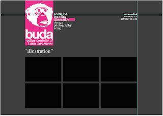
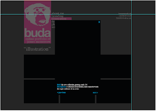

Variations of colours for each section.

Possible gallery page layout.

How when gallery image is clicked, would open in lightbox with a description.
Feedback from the critique is as follows -
- Serif font doesn't fit in with design
- Is the monkey too detailed?
- Experiment with websites and technologies
- Look into java for images
- Will CMYK be popular forever?
- Take on an outside approach - monkey wouldn't appeal to all companies, therefore cutting down my target audience.
The feedback has been really useful, and it seems there is a lot for me to think about!
- Serif font doesn't fit in with design
- Is the monkey too detailed?
- Experiment with websites and technologies
- Look into java for images
- Will CMYK be popular forever?
- Take on an outside approach - monkey wouldn't appeal to all companies, therefore cutting down my target audience.
The feedback has been really useful, and it seems there is a lot for me to think about!
9.12.08
[FURTHER RESEARCH]
After noticing that I had researched into all dark background sites, I saw it best to research into light coloured websites. Ones that stand out that I have researched so far include -
- http://www.eatock.com
- http://www.tonky.fr
- http://www.effectivedesign.com
- http://www.susannedunkel.com
- http://www.ivanmato.com
I've found these lighter websites, mostly white, to be much cleaner and simplistic in design. I find this makes for a more user friendly appearance and something that I'm seriously considering for mine.
- http://www.eatock.com
- http://www.tonky.fr
- http://www.effectivedesign.com
- http://www.susannedunkel.com
- http://www.ivanmato.com
I've found these lighter websites, mostly white, to be much cleaner and simplistic in design. I find this makes for a more user friendly appearance and something that I'm seriously considering for mine.
5.12.08
[IDENTITY PROGRESSION]
Before I can crack on with the layout designs of the site I need to brand myself. A lot of the sites that I have researched, the designer uses a creative identity. I like the idea of this and since I was young I have had the nickname of 'Buddah' (yup spelt incorrectly!)
This however I feel isn't snappy enough so I've quite simply taken away some letters, and gone with the creative identity of 'Buda'.
I then had to think of things that represent me. I see myself as both a Graphic Designer and an Illustrator. Colour wise it's going to be CMYK as I've built up quite an obsession with these! Font wise it's going to have to be a clean simple san serif font such as Helvetica or Myriad Pro, but maybe I could incorporate this with a serif font?
I also need to think of a logo to represent myself. Ideas that have come into my head include symbols and shapes, printers marks, and monkeys.
I've decided for now to go down the monkey route as it's fun and original. This is what I've come up with so far...

This however I feel isn't snappy enough so I've quite simply taken away some letters, and gone with the creative identity of 'Buda'.
I then had to think of things that represent me. I see myself as both a Graphic Designer and an Illustrator. Colour wise it's going to be CMYK as I've built up quite an obsession with these! Font wise it's going to have to be a clean simple san serif font such as Helvetica or Myriad Pro, but maybe I could incorporate this with a serif font?
I also need to think of a logo to represent myself. Ideas that have come into my head include symbols and shapes, printers marks, and monkeys.
I've decided for now to go down the monkey route as it's fun and original. This is what I've come up with so far...

30.11.08
[INITIAL RESEARCH]
After some background research into what the web is and what it's future looks like I've decided to crack on with researching other designers portfolio sites.
A few that I've stumbled upon that I particularly like at this stage are -
- http://superlover.com.au
- http://aeiko.net
- http://dieneuemodern.com
- http://inside.nile.ru
- http://vault49.com
The main pages that I have been looking at are the home (index_ page, the gallery, and the about me/info page. As I feel these are the main pages that need to be designed, as they will either be containing a lot of images and/or text.
It has been interesting seeing the vastly different galleries ranging from tiled to sliding to lightbox. One thing I have noticed is that I have only been looking at really dark sites so far, so need to go in the search of some lighter ones!
A few that I've stumbled upon that I particularly like at this stage are -
- http://superlover.com.au
- http://aeiko.net
- http://dieneuemodern.com
- http://inside.nile.ru
- http://vault49.com
The main pages that I have been looking at are the home (index_ page, the gallery, and the about me/info page. As I feel these are the main pages that need to be designed, as they will either be containing a lot of images and/or text.
It has been interesting seeing the vastly different galleries ranging from tiled to sliding to lightbox. One thing I have noticed is that I have only been looking at really dark sites so far, so need to go in the search of some lighter ones!
27.11.08
[NEW UNIT - WEB DESIGN]
Finally just handed in everything for Visual Communication in Context 2 which is a huge relief. But no sooner as I get some weight off my shoulders I have something new jumping on. Today we were also given our brief for Screen Based Communication 2. I have been looking forward to this brief for absolutely ages, after seeing the then second years working on it last year. The main aim of the brief is for us to produce a web portfolio, which will house our work, acting as an online portfolio and curriculum vitae.
I really want to do well in this unit. I previously did ICT at A-Level and gained experience in Dreamweaver then, as well as taking part in the ABC Dreamweaver course (which I need to complete and hand in!). This unit isn't just about learning a new program and getting a grade, it is something that will be integral in getting my name out there and getting work.
There are lots of things to consider in this unit. The first point of call is for me to produce an identity for myself. Something that people can look at and get an idea of who I am and what my work is. Do I see myself as a graphic designer or as an illustrator, or both? Will I go under my alias 'Buda' or my name? I also need to think of what I want on my site, and how my site is to be navigated through. I need for my website to be unique and simple, something that people will enjoy looking through, and keep coming back to, to see what's new. This is all going to take a lot of research and hard work but I can't wait!
Was set our new brief today. The outcome is to be an online portfolio website that is easy to navigate and that represents us. I've been looking forward to this brief since I saw last years 2nd years building theirs. It feel that this is the first project to be of 'proper' use to get a name for ourselves, as we are presenting all our work that we have done so far, and showing off our web design skills on the way.
I really want to do well in this unit. I previously did ICT at A-Level and gained experience in Dreamweaver then, as well as taking part in the ABC Dreamweaver course (which I need to complete and hand in!). This unit isn't just about learning a new program and getting a grade, it is something that will be integral in getting my name out there and getting work.
There are lots of things to consider in this unit. The first point of call is for me to produce an identity for myself. Something that people can look at and get an idea of who I am and what my work is. Do I see myself as a graphic designer or as an illustrator, or both? Will I go under my alias 'Buda' or my name? I also need to think of what I want on my site, and how my site is to be navigated through. I need for my website to be unique and simple, something that people will enjoy looking through, and keep coming back to, to see what's new. This is all going to take a lot of research and hard work but I can't wait!
Was set our new brief today. The outcome is to be an online portfolio website that is easy to navigate and that represents us. I've been looking forward to this brief since I saw last years 2nd years building theirs. It feel that this is the first project to be of 'proper' use to get a name for ourselves, as we are presenting all our work that we have done so far, and showing off our web design skills on the way.
Subscribe to:
Posts (Atom)