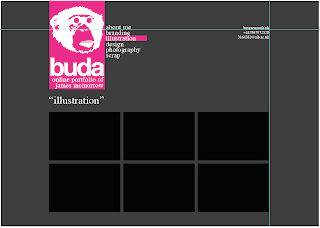
Variations of colours for each section.

Possible gallery page layout.

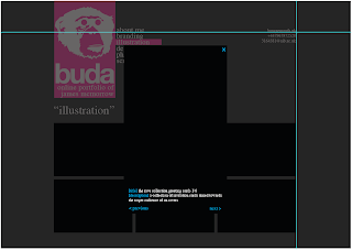
How when gallery image is clicked, would open in lightbox with a description.
Feedback from the critique is as follows -
- Serif font doesn't fit in with design
- Is the monkey too detailed?
- Experiment with websites and technologies
- Look into java for images
- Will CMYK be popular forever?
- Take on an outside approach - monkey wouldn't appeal to all companies, therefore cutting down my target audience.
The feedback has been really useful, and it seems there is a lot for me to think about!
![[blog of designer and illustrator james mcmorrow]](https://blogger.googleusercontent.com/img/b/R29vZ2xl/AVvXsEgxz4ROutX4LQyqFY7iwyLaHGg5J5uDWu5wp1BsK3ZqniPF7k2j2jr20Ftnv2RfekS_fMeluvnTfDPpO7sTMuBv9Cdxkxw6XItFpNc-ToY5hNx-_uyhaXqrebeF0jX_oJJjyTMOvFFvRcDs/s1600-r/blog_header.gif)

No comments:
Post a Comment